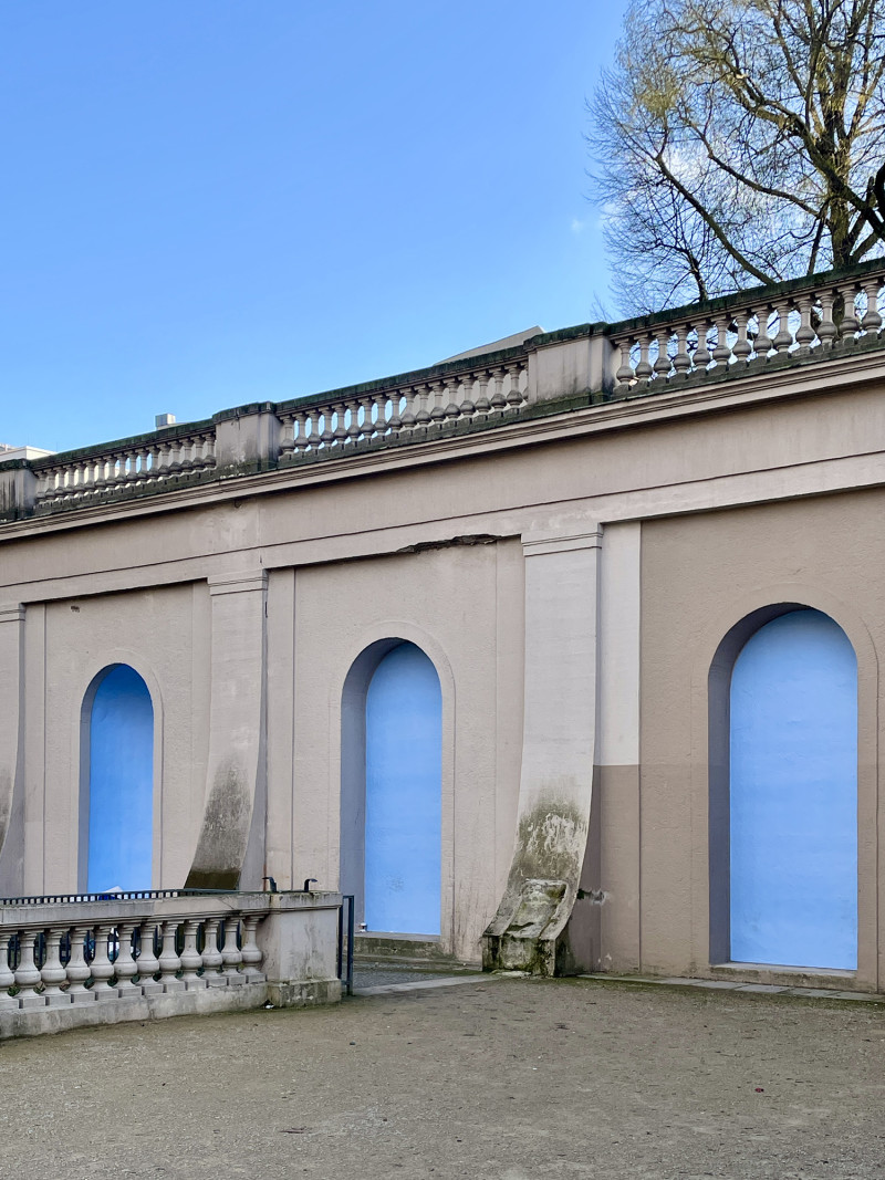
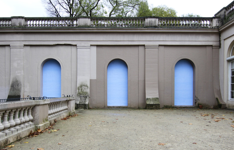
The intervention There, Here takes up the round arches of the neo-baroque architecture at Körnerpark and opens up a dialogue between material, space and illusion.
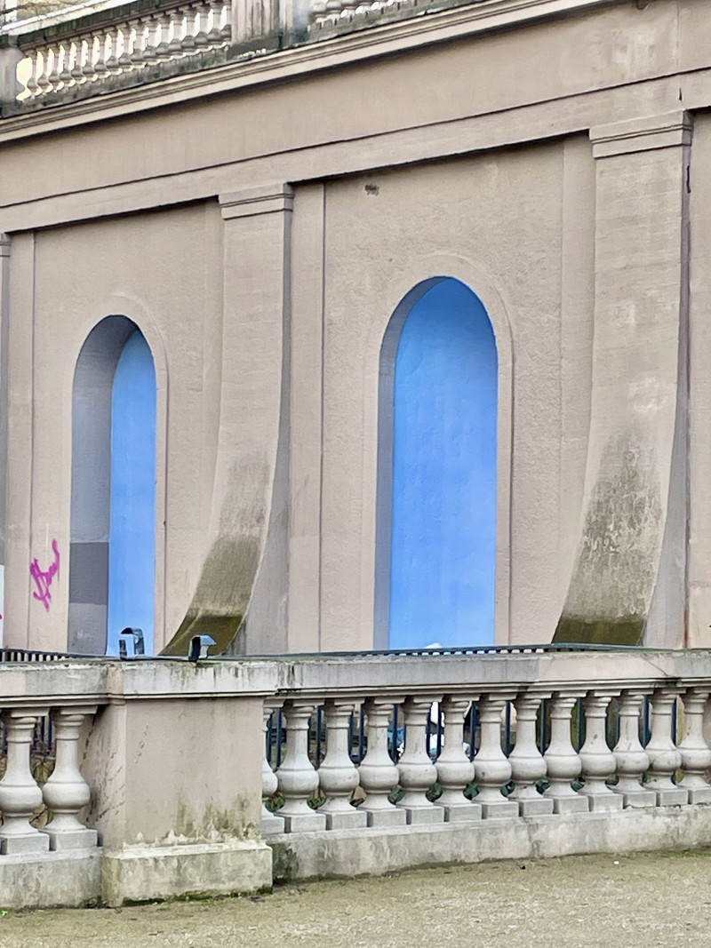
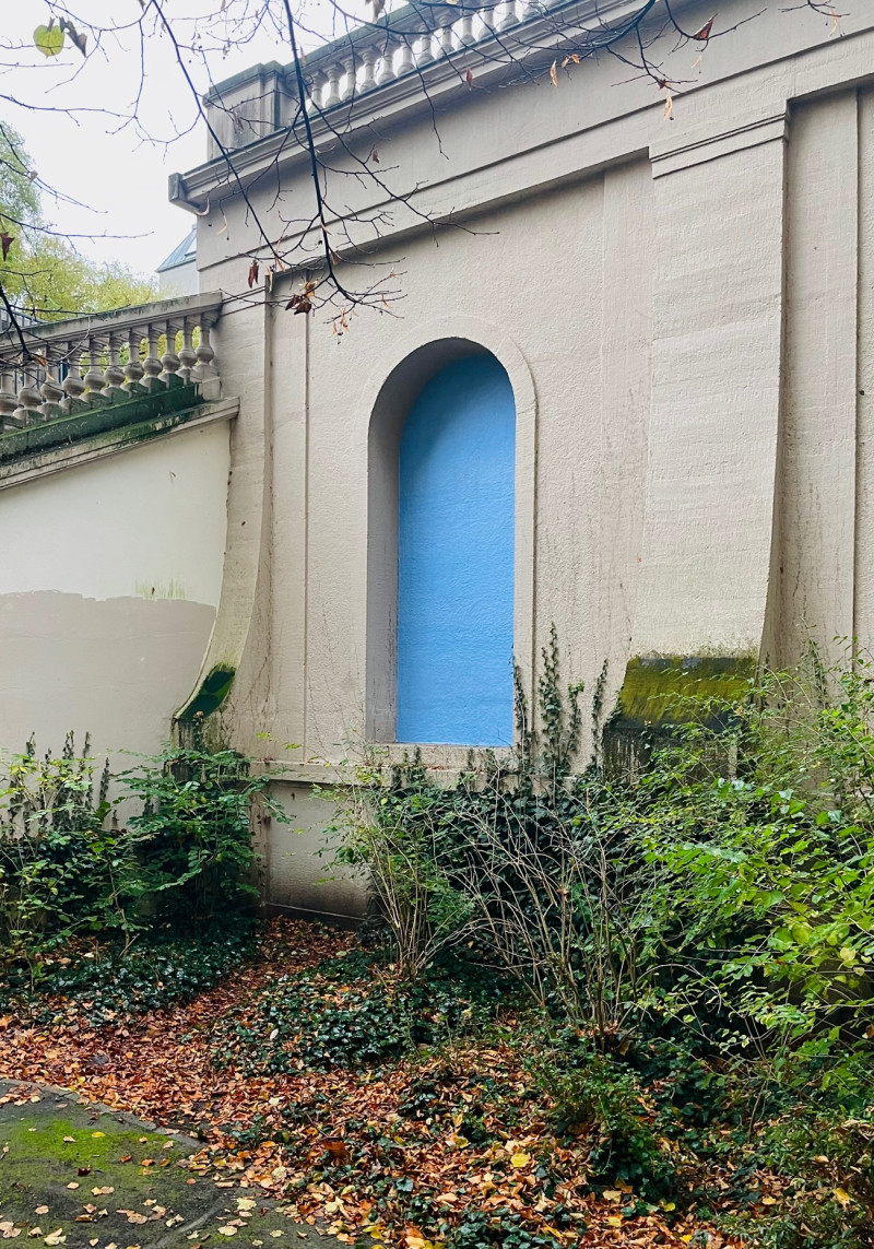
In each of the twenty niches, placard paper is attached - albeit with the sky-blue reverse side facing outwards - making the colour blue the protagonist of the site-specific wall work. In its usual function, the blue reverse side of the poster paper serves to prevent previous layers of advertising posters from showing through. Here, its repositioning transforms it into the abstract.
The material, actually a medium for communication, is transformed here into an element full of ambiguity and draws attention to the interplay of form, colour and surroundings.
The geometric unity of the blue surfaces suggests a façade and echoes the classic motif of the window in painting. The impression of a sky reflected in these windows could be understood as an allusion to an unfulfilled longing - for an imagined south or an idealised past.
This poetic suggestion of distance enters into a dialogue with the historic park which itself evokes the air of an utopian place and is reflected in the ephemeral nature of the blue hour, that fleeting moment when the sky shines bright blue in the transition from day to night.
In collaboration with Kris Douglas
Curated by Clara von Schwerin


